| data and the one they choose to show: 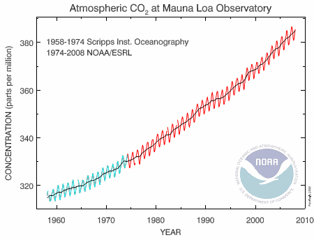
[ http://www.esrl.noaa.gov/gmd/ccgg/trends/ ]
scroll down page halfway 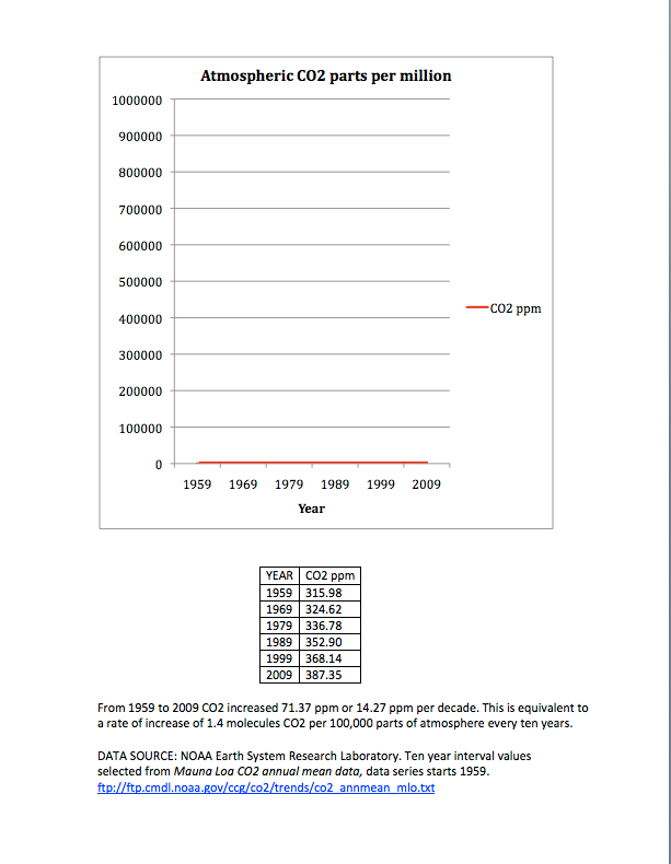
Which graph is more misleading? One shows the trend, the other shows the proportion of CO2 as a component in the atmosphere and doesn't exaggerate the rate of increase. Perhaps both should be shown side by side if one is truly interested in not being misleading.
. .
 Chance favors the informed |


